
TV Detail Page Redesign
This project aims to improve user engagement and Increase purchase rate.
@Walmart - VUDU
Type
Work Project
(Development in progress)
My Role
End to End
Product Designer
Time
06.2019 -
10.2019
Team
Project Manager
UX Researcher
Engineer: Web team (6)
BACKGROUND
Users' Needs
The detail page design has not been improved in 3+ years.
In the monthly satisfaction surveys, only 43% of users satisfied with the current detail page. However, average satisfaction is 52%.
A lot of users request updated user experience & visual design. Following are some selected user feedback:
" Too much information to look at."
" Navigation of episodes is tough."
" The design is outdated."
Impact Perspective
The detail page takes a 57% page view, which is the most important page on the platform.
It also leads directly to the purchase flow, which contributes 86% of total revenue.
Improve the detail page will have the following impacts:
-
Increase user engagement rate
-
Increase purchase rate and revenue
DISCOVERY RESEARCH
To narrow down the scope of the user problem, I worked with UX researchers to launch an online survey via SurveyMonkey.
Major of 100 Vudu user problem falls into the following category:
Navigation
60%
of first-time users found it too much effort to locate the episode.
Information
52%
of users complained about the vertical information structure.
DESIGN PROBLEM
I worked with UX researchers to test with target users and uncovered the following challenges:
(Testing tool: usertesting.com)

Busy Information Hierarchy
Difficult to find the major CTA buttons when it's hidden in between movie name and movie synopsis.
Lenghthy Epiosdes Navigation
Episodes are taking too much space and mixed with extra content.
Low Discoverability
Information like cast and similar titles were tested that drives user engagement but is hidden at the bottom of the page.
DESIGN OPPORTUNITIES
Improve information hierarchy design
Increase information
discoverability
Improve navigation
efficiency
PROJECT GOAL
Improve user satisfaction 20%+
User satisfaction survey from 43% to 52%+
Increase user engagement 10%+
User page view from 57% to 63%+
Design Process
DESIGN APPROACH
To understand the target users' behaviors, I worked with user researchers to get the following data from survey:
What are the key reasons for users to make the purchase decision?

What's user behavior when navigating a detail page?
Following is the data of the current page visitor rate and conversation rate of each section:

DESIGN IDEATION
Design Principles
01
Clear display information that user care
02
Intuitive navigation pattern
03
Keep the layout simple and clean
04
Easy to locate
the episode
Information Hierarchy
I improved the information hierarchy by grouping different functions to create a clear structure:

Navigation Exploration
The following are the wireframes of 4 different interaction models

Gather 40 current & new Vudu users' feedback about proposed layout design options.
(Testing tool: usertesting.com)
Research Result Analysis:

Overall, the proposal that received the most successful and helping user finish tasks was: Design B
DESIGN SOLUTION
Design Goal 1:
Improve Information Hierarchy Design
The simple and clear information hierarchy helps the user to quickly understand the content of this movie or TV show.

Redesign 1: Simplify the information based on survey data. Redesign the UI components with different visual treatments.

Old Design

New Design
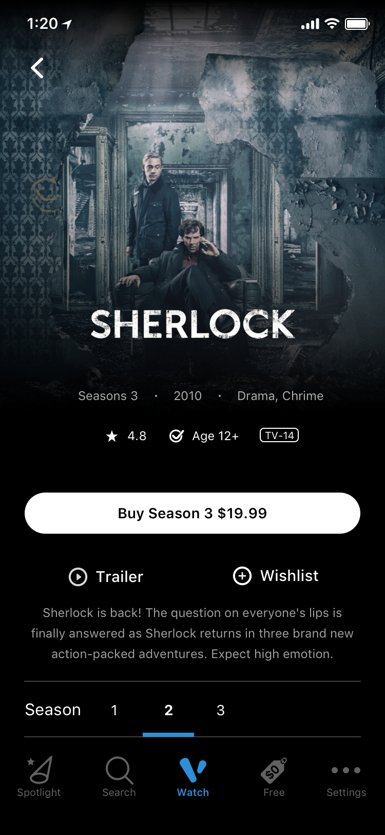
Redesign 2: Components dynamically change based on the different ownership status of the content. Users can catch-up easily or access what they need within one click.

Before Purchase

After Purchase
Design Improvements
I worked with UX researchers to compare the old & new design. We got the following results:

Base on feedback from 10 users
Design Goal 2:
Increase information discoverability & navigation efficiency
The clear navigation structure gives users a faster way to navigate between different information.

Redesign 3: Reorganize episodes list to easily locate with interactive transactions.

Old Design

New Design
Redesign 4: Increase the visibility of cast & crew with more depth information.

Old Design
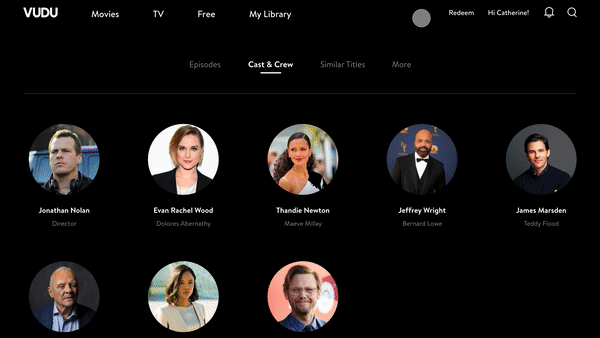
New Design
Design Improvements

Base on feedback from 10 users
Design Measurement
PROTOTYPE TESTING
Comparison testing between mockups and old design with 40 users
Testing method: Online testing (usertesting.com); In-person testing


TESTING RESULT SUMMARY


Improve information hierarchy design
45%
Users think it’s easier to understand the title.


Increase navigation efficiency
52%
Users think it’s faster for seasons & episodes navigation.


Increase information
discoverability
40%
Users discover relevant information faster.
CROSS PLATFORM
Mobile Platform


TV Platform


DESIGN IMPACT
Increased the user satisfaction and engagement
We launched the A/B testing with the new detail page. Following are the testing results:
-
User satisfaction rate increased by 28%
-
Detail page view increased by 12%
REFLECTION
What would I do next?
Push to build up the heatmap tracking system
The analytic team only tracks data on pageviews and purchase behaviors. However, designers need more data that shows users' activities on the platform interface to optimize product design.
I'm now working closely with the analytic team on defining the correct data categories for the valuable analytical results.